DANIEL SMITH WATERCOLORS
SOPHISTICATED CHAOS WITH DANIEL SMITH WATERCOLORS
STEP BY STEP PAINTING LARGE SCALE BY KEN KARLIC
NOVEMBER 8, 2017
KEN KARLIC / SOPHISTICATED CHAOS WITH DANIEL SMITH WATERCOLORS

My style of watercolors can best be described as sophisticated chaos, where an accurate drawing gives way to an expressive painting to create a beautiful mess. I’ve recently begun painting large-scale works in the studio, which allows me to magnify my style to a whole new level, more like mammoth chaos. I can push everything about my work—more design, drawing, painting, paint, and effects. In this step by step, I’d like to share the process of creating a large-scale work which inspired by a large-scale site. I focus on design, drawing, and painting—regardless of the scale of the piece. Within the tight structure of the design and drawing, there’s great freedom to expressively apply paint—and lots of it.

Step 1 / Design for "GAF on Ponca"
DESIGN / STEP 1
My process begins with design. I used a large number of on-site sketches and dozens of photographs for "GAF on Ponca", a 36 x 72 inch painting based on a huge industrial plant in Baltimore, Maryland. I’m drawn to this particular site because of it interesting shapes, complexity of forms, and pure scale. The challenge is in capturing the feel, while not getting overwhelmed with the chaos. It is as much about what to edit as it is about what to include. In Photoshop, I combine, distort, cut, paste, and move pieces, so that ultimately, the design is my own creation as much as that of the original source material.

Step 2 / Drawing for "GAF on Ponca"
DRAWING / STEP 2
I use 140# cold press watercolor paper on a roll, wet it, and stretch it directly to the wall of my studio to dry flat and smooth. Using a carpenter’s level, I divide the sheet vertically and horizontally into quarters, so that I may translate my small-scale reference to a larger surface. I carefully build up the drawing, and shade areas freely, not concerning myself with any stray pencil marks. At this point the focus is on providing myself guidelines as I paint, because I know things will get chaotic. Ultimately, many of the drawing lines may remain visible, as my finished piece is typically a marriage of painting and drawing. Once I’m happy with my drawing, and feel there’s enough information, I am ready to begin painting.

Step 3 / DANIEL SMITH Paints for "GAF on Ponca"
THE PAINTS / Step 3
For me, DANIEL SMITH Watercolors are an invitation to experimentation. After using other brands for years, I chose DANIEL SMITH for the quality of pigments and how they behave, but I LOVE them as much or more for how they MISBEHAVE, with the granulating effects and how they fall apart — beautifully — creating textures unachievable by any other means I’ve found with any other paints. With GAF on Ponca, I decided to really experiment by pushing the colors and effects, as the design seemed to require it. I chose to work with three color families — my standard palette of 14 colors, 15 PrimaTek colors, and another 10 iridescent colors. Some of the colors available with DANIEL SMITH are totally unique and desirable to that which I’m interested.

Step 4 / Painting "GAF on Ponca"
PAINTING — FIRST WASHES / STEP 4
I begin painting initial washes using large, squirrel hair, mop brushes and attack the sheet as fast as possible, blocking in areas with clean color, and retaining critical areas of the white of the page. I use lots of paint and lots of water. I’ll splash water with my fingers, and even apply paint directly from the tube, and scrub it with my fingers. If I’ve gone too far, if there is such a thing, I simply use my spray bottle as an eraser and spray passages off. Typically, this may take 10-30 minutes depending on the painting, but at 18 square feet, GAF on Ponca, admittedly required more time and work. I add by brushing pigment, and subtract by spraying water, scrubbing with brushes and even my hands, creating effects in any way possible and with any means necessary. I continue to paint, build, modify, define, create, destroy, add, and subtract, until it’s time to step away and let it dry for the night.

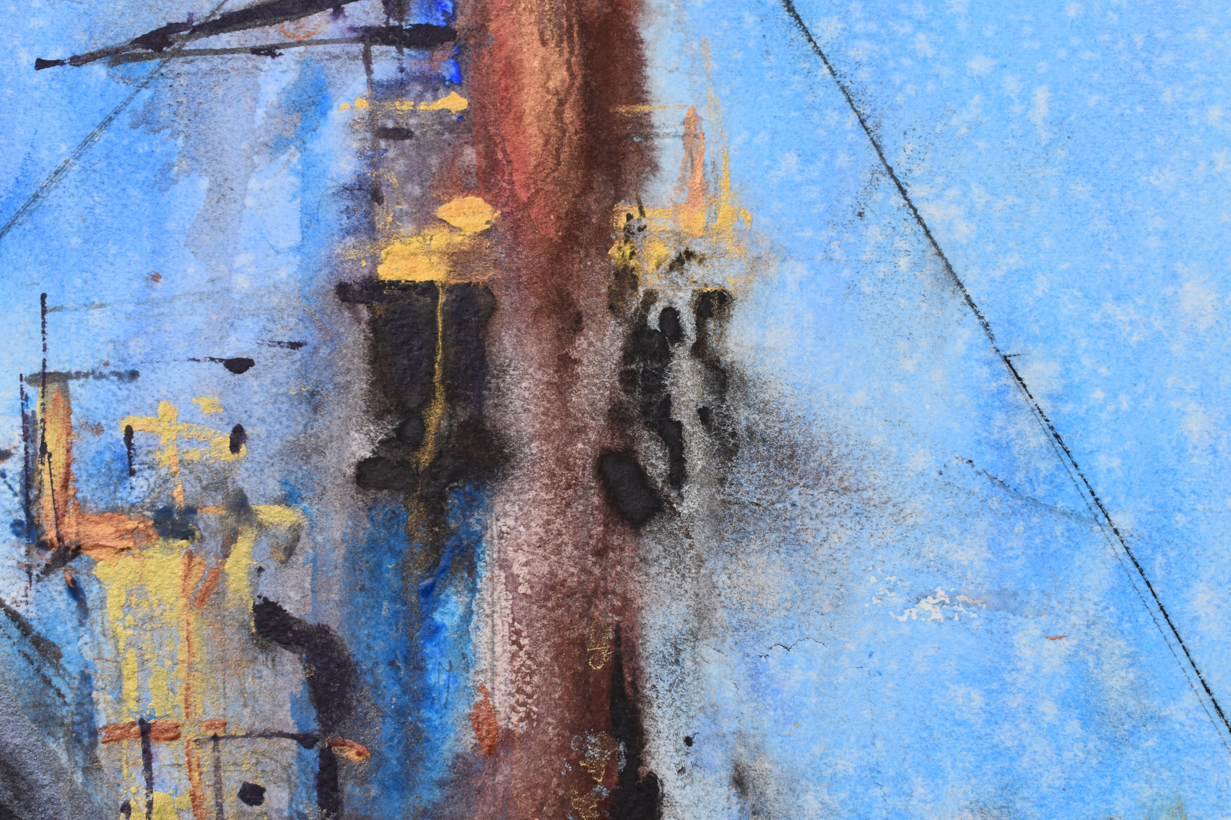
Step 5 / Maximizing PrimaTek Watercolor Effects for "GAF on Ponca"
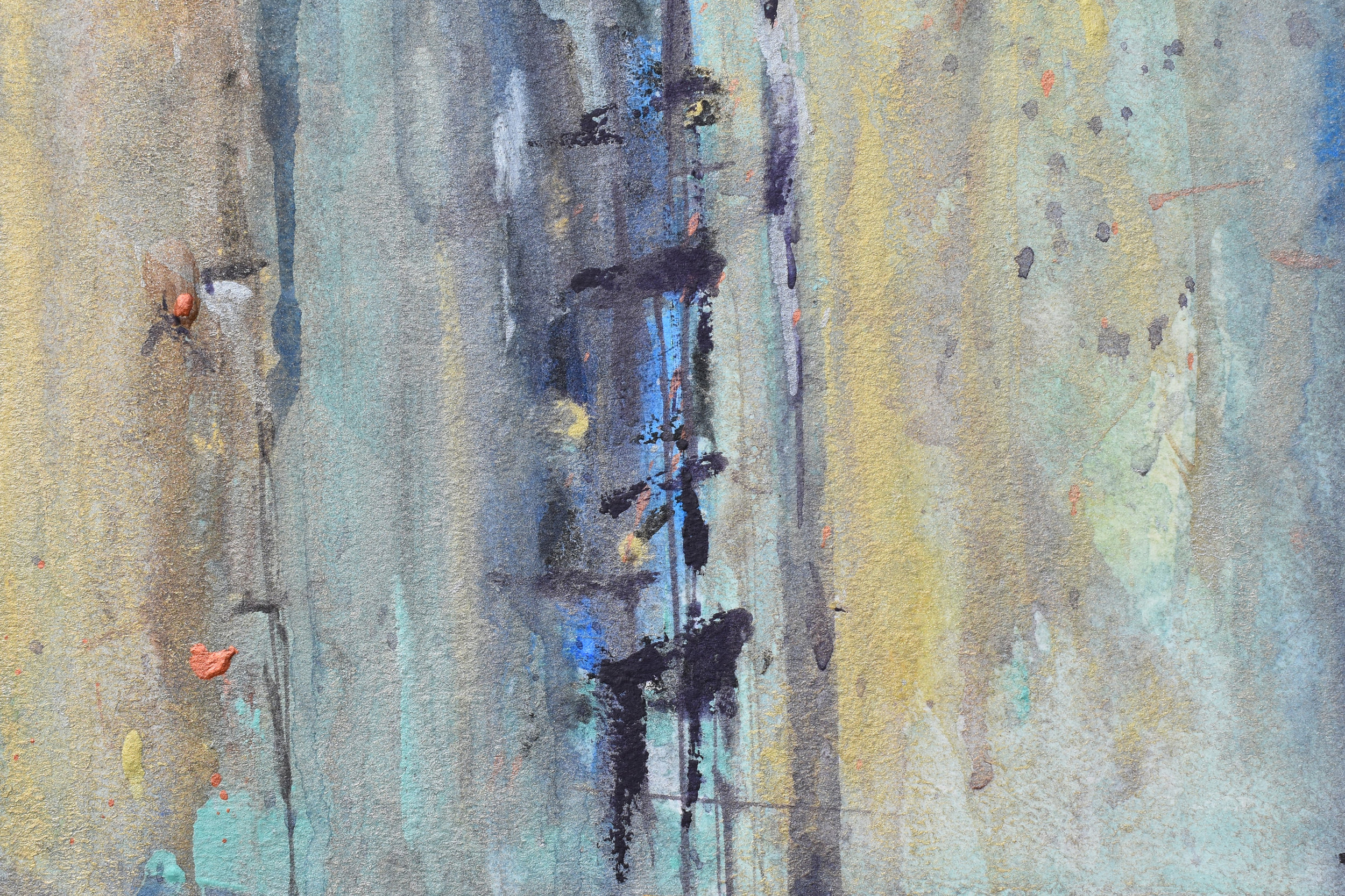
MAXIMIZING EFFECTS WITH PRIMATEK WATERCOLORS / STEP 5
In the beginning, I look to achieve as much action on the page, with lots of variety of color and maximum effects — more is more. I work to connect the separate islands into masses, and work towards relating unrelated areas. I’ll wet areas, scrub them out, add and subtract, create and destroy, and repeat over and over, modifying the whole time. This phase is incredibly frenzied and frenetic, and even physical. I use several of the PrimaTek colors applied thickly, adding water on the paper to take advantage of the granulating effects. I mix directly on the paper, and allow the paint to drip, run, and splatter, as it will.

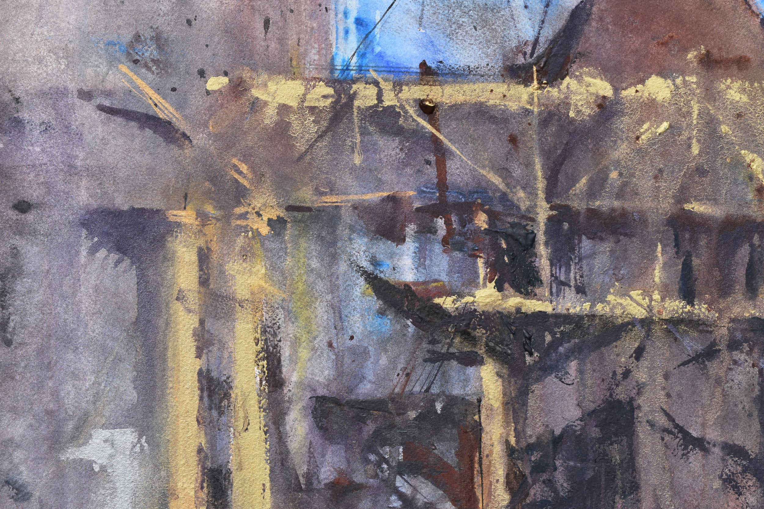
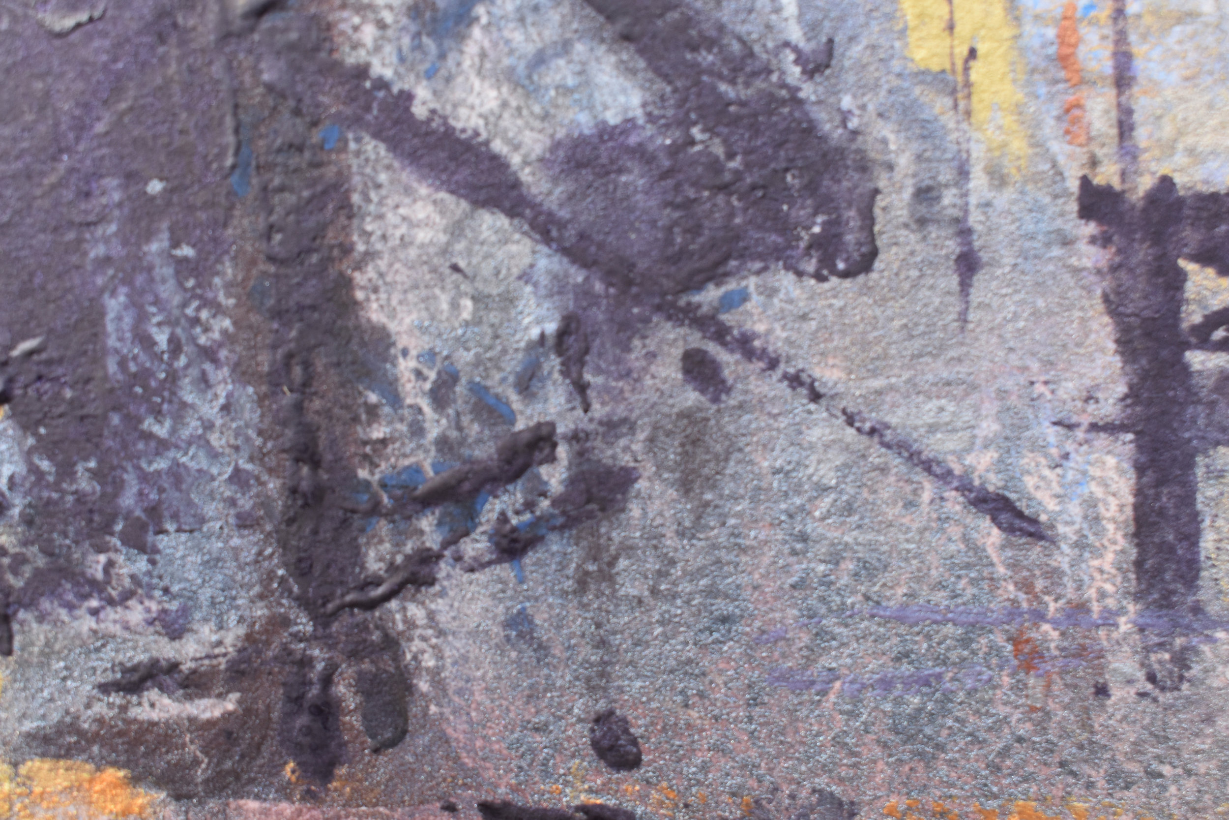
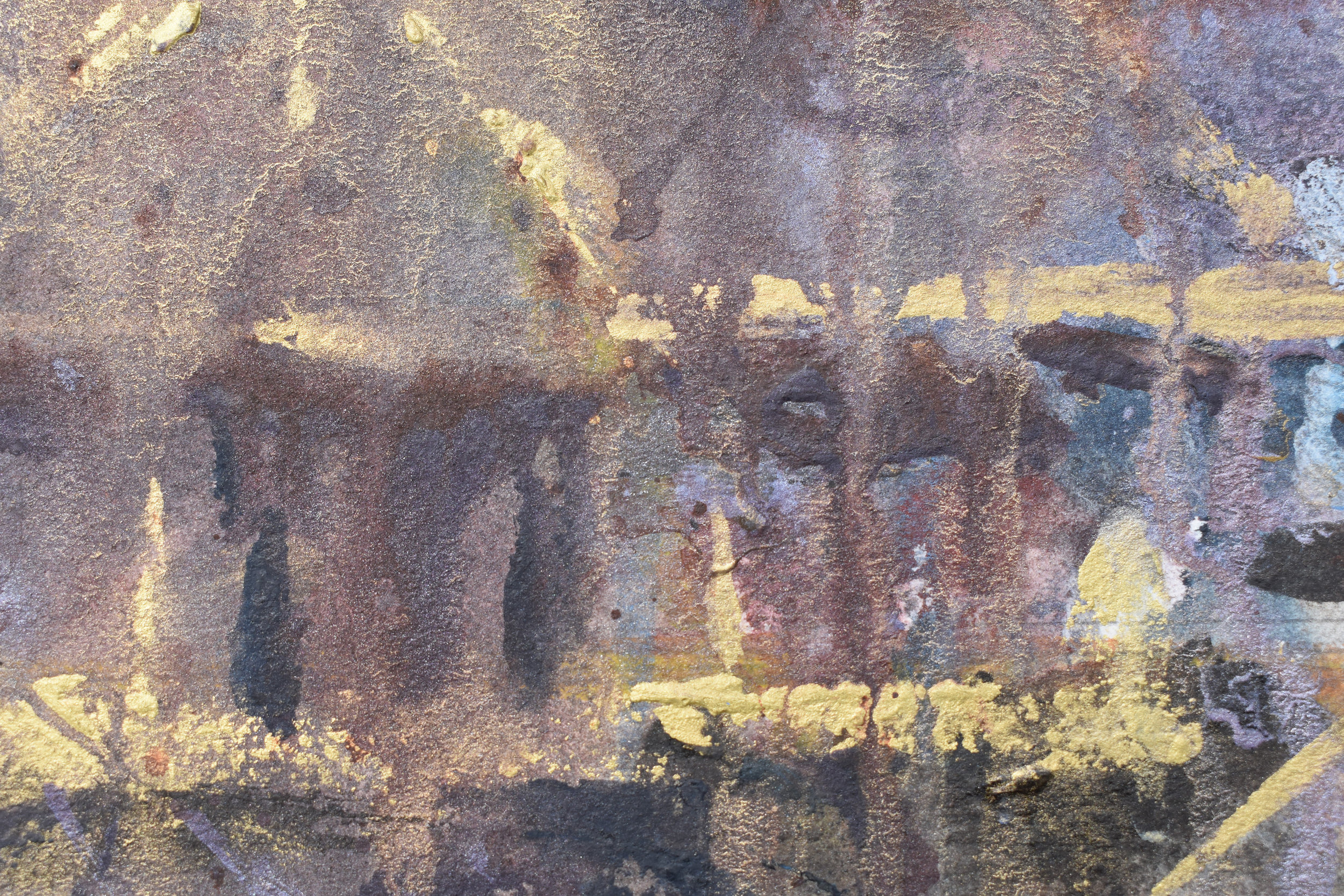
Step 6 / The shimmer effects of Iridescent Watercolors for "GAF on Ponca"
SHIMMERS OF METALS WITH IRIDESCENT WATERCOLORS / STEP 6
Using DANIEL SMITH Iridescent colors make possible the subtle shimmers of metals in golds, silvers, coppers, and even blues. I apply glazes using several iridescent colors, mixing them into other colors, or using directly as is. After working into a wet painting, it can be misleading as what’s really happening. Entire passages may appear muddy or overworked when the iridescents are very translucent. However, having allowed the painting to dry, what’s left behind is pure, rich, and beautiful, and the painting appears fresh, bright, and reflective. One can literally see the flakes of iridescent particles sitting on the surface of the earlier layers of paint, and it creates an absolutely stunning effect.

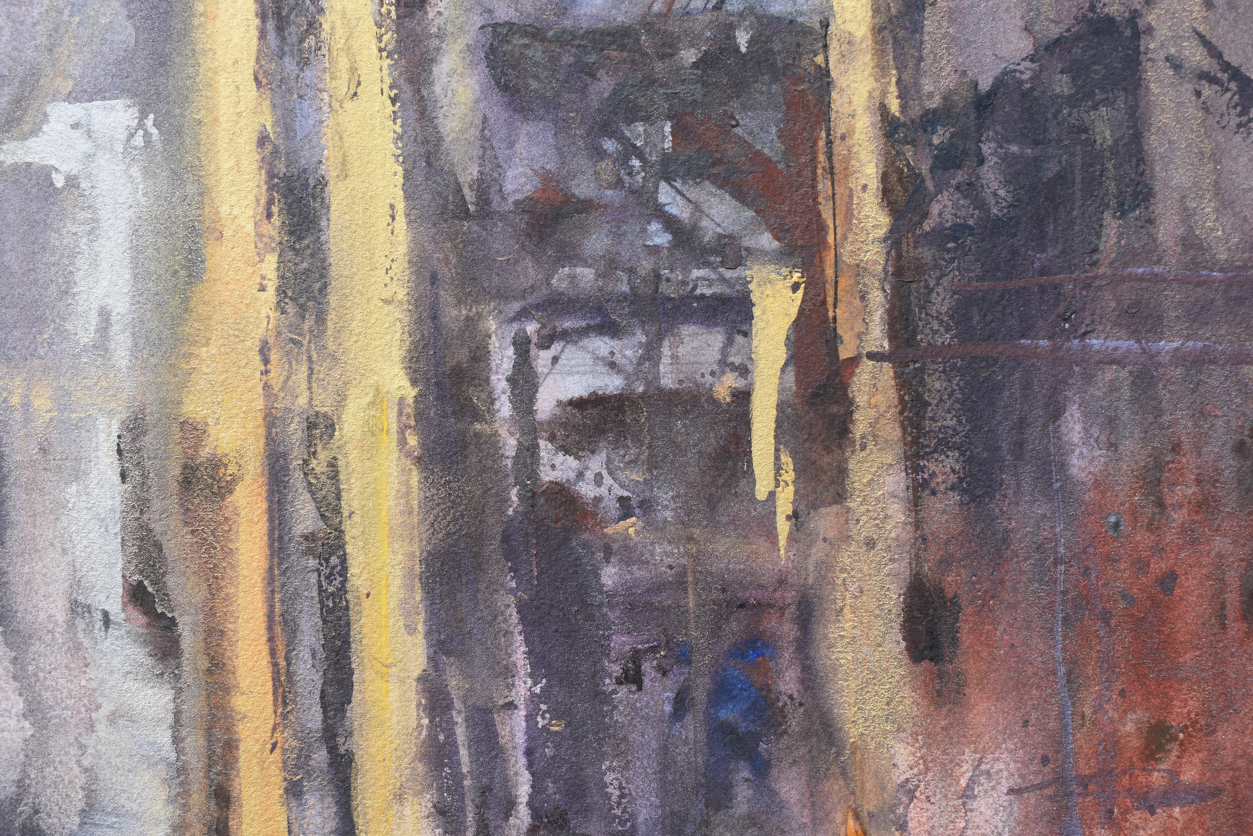
Step 7 / Refinement for "GAF on Ponca"
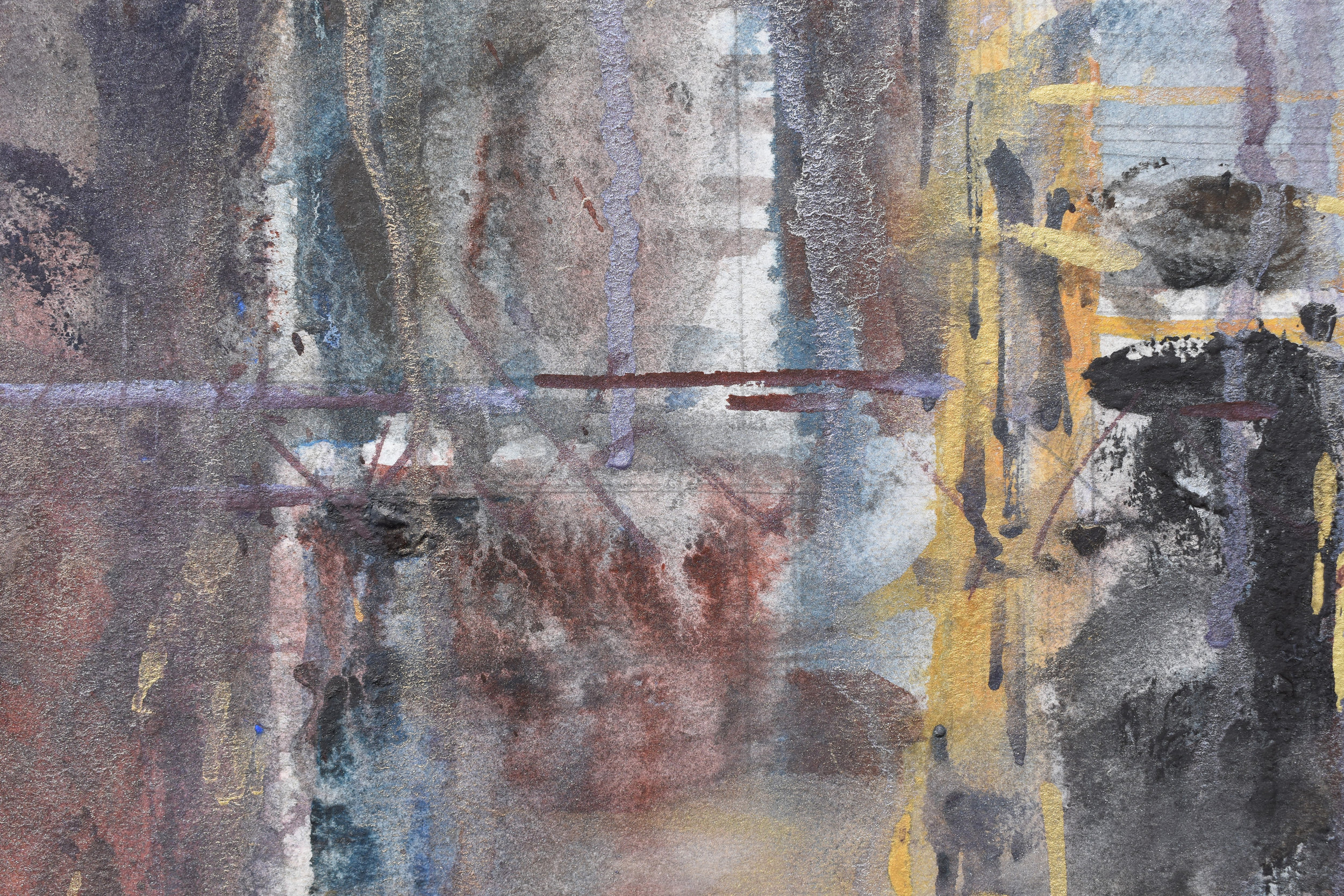
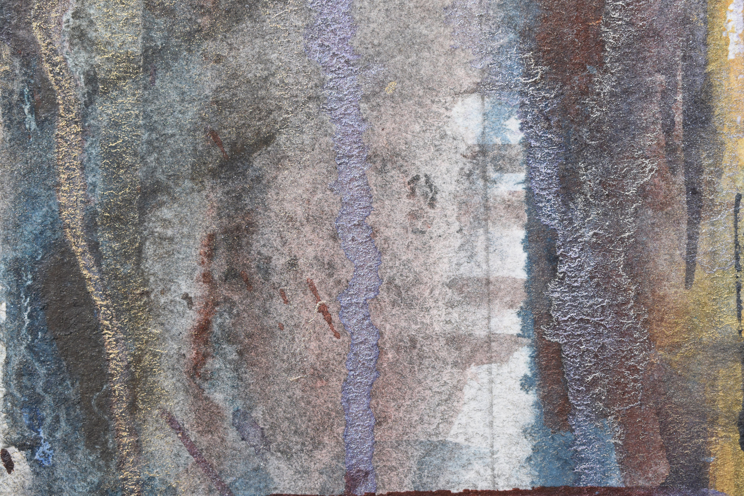
REFINEMENT / STEP 7
As I move on, I must be more judicious as to what remains and what disappears. I work on levels of contrast from dramatic to nuanced. I use stiff synthetic brushes, soft synthetic sable liners, spray bottles, my fingers, my fingernails, palette knives, and paper towels. I’ll apply passages and marks of dark, scratch out areas of light, continue to build and refine. I never follow a so-called linear process, as even after this stage I may apply washes, scrub areas out, add, and subtract. I’ll dress up the painting with the final jewelry, including pipes, handrails, wires, and various marks. I don’t paint in a traditional sense of light to dark, but rather light AND dark, building opaque over translucent, and vice versa, until I reach a sense of completion.
– Ken Karlic

"GAF-On-Ponca", watercolor by Ken Karlic, 36 x 72 in. Final

Ken Karlic
Originally from Chicago, Ken Karlic is a national award-winning artist, and paints in a style he refers to as sophisticated chaos. He paints with a sense of urgency, and passion, that is more about capturing the essence of a subject, rather than the specifics of any location. He is interested in expressing how something feels rather than how it looks, and in the sheer physicality of a subject captured in the sheer physicality of the paint.
Ken’s paintings have a basis in the representational, but often dissolve into varying levels of abstraction. No two paintings develop in the same way, as surprises are not only welcomed — but also invited — as marks, scratches, drips, and splatters, all become part of the final piece. On location or in the studio, he enjoys the contrast of painting quickly, while creating a piece to be experienced slowly.</p>
Ken Karlic exhibits regularly, participates in invitational and juried plein air competitions, and is represented by several galleries from Maryland to New York, including McBride Gallery (Annapolis MD), Y:ART Gallery (Baltimore MD), Red Raven Art Company (Lancaster PA), Gallery 222 (Malvern PA), and Ris Gallery (Jamesport NY). Ken has recently been featured in the September, 2017, issue of “The Art of Watercolour,” published in France, and the October/November, 2017, issue of “Plein Air Magazine.”
Ken Karlic studied architecture, painting, and graphic design at the University of Illinois in Urbana-Champaign, where he received a B.F.A. Ken is a founding partner of the graphic design firm, Splice Design Group, in Baltimore, Maryland, with clients including the Guggenheim Foundation. He is an instructor at Chesapeake Fine Art Studio in Stevensville, Maryland, and teaches workshops regionally, and beyond.
Website: KenKarlic.com / SpliceDesignGroup.com
Facebook: Facebook.com/KenKarlic
Instagram: @KenKarlic
WHY I CHOOSE DANIEL SMITH WATERCOLORS
I use DANIEL SMITH Watercolors as much, or more, for how they MISBEHAVE, because of their granulation and how they fall apart—beautifully—creating effects and textures unachievable by any other means I’ve found with any other paints. Some of the colors available with DANIEL SMITH are totally unique and desirable to that which I’m interested, specifically, the PrimaTek and Iridescent colors. With DANIEL SMITH, my vision, technique, subject, and materials combine for a perfect fit, and simply put, they allow me to communicate how I feel and what I experience.
DANIEL SMITH WATERCOLORS USED IN THE PAINTING

Ken Karlic's palette of his standard DANIEL SMITH Watercolors
Palette 1 / Standard DANIEL SMITH Watercolors (14)
Ultramarine Blue, Cobalt Blue, Cerulean Blue, Manganese Blue Hue, Cobalt Turquoise, Cobalt Violet, Moonglow, Cadmium Red Scarlet Hue, Cadmium Yellow Light Hue, Yellow Ochre, Indian Red, Burnt Sienna, Ivory Black, Chinese White

Ken Karlic's palette of DANIEL SMITH PrimaTek Watercolors
Palette 2 / PrimaTek Watercolors (14)
Mayan Blue Genuine, Lapis Lazuli Genuine, Fuchsite Genuine, Sugilite Genuine, Amethyst Genuine, Kyanite Genuine, Burnt Tiger's Eye Genuine, Blue Apatite Genuine, Garnet Genuine, Bronzite Genuine, Burnt Bronzite Genuine, Black Tourmaline Genuine, Bloodstone Genuine, Hematite Genuine

Ken Karlic's palette of DANIEL SMITH Iridescent Watercolors
Palette 3 / Iridescent Watercolors (10)
Iridescent Blue Silver, Iridescent Sapphire, Iridescent Gold, Iridescent Aztec Gold, Iridescent Topaz, Iridescent Goldstone, Iridescent Moonstone, Iridescent Antique Bronze, Iridescent Antique Copper, Iridescent Copper

Detail of Ken Karlic's palette of DANIEL SMITH Iridescent Watercolors